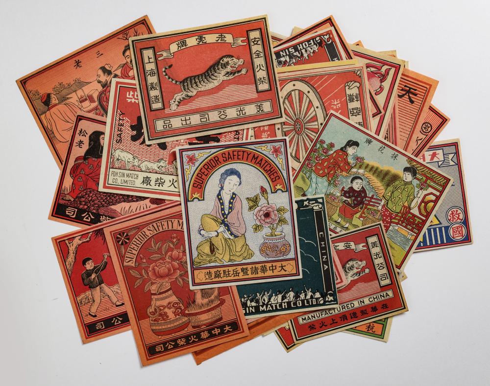

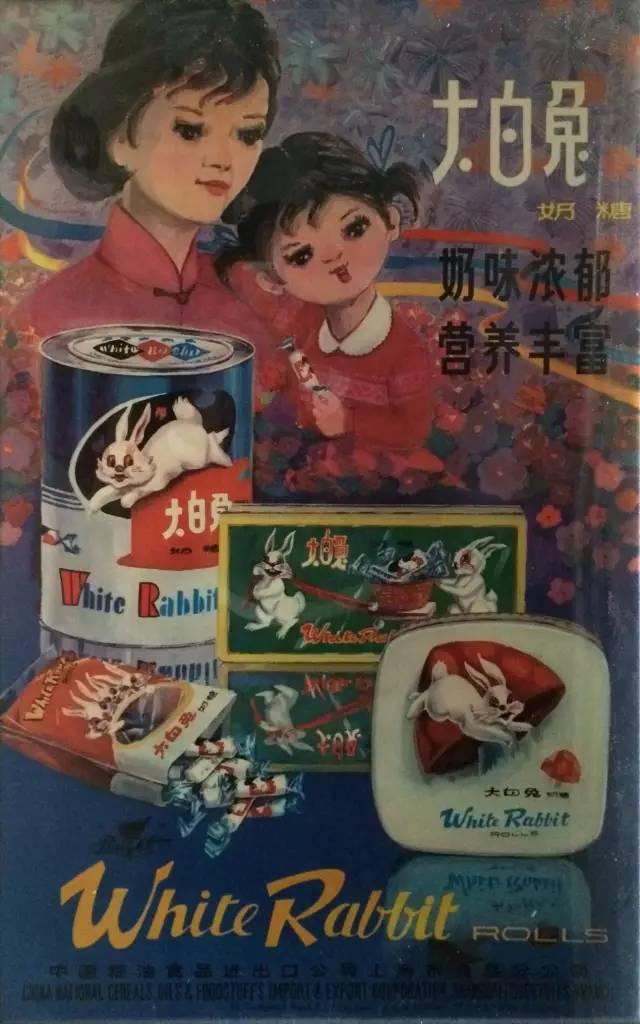
The first thing you notice is the smell—sweet and creamy, like pouring condensed milk on toast. Back in the day, in small shops near your school, glass jars held stacks of white, blue, and red wrappers, each one folded neatly around a piece of 大白兔 (White Rabbit) milk candy. The mascot—round-faced, with a pair of long ears—looked ready to hop off the paper. You peel away the waxy rice paper and place it on your tongue, feeling it melt before you eat the candy itself. For a child in the 1970s or early 80s, this wasn’t just a treat. It was a pocket-sized piece of joy, wrapped in a design that felt as much a part of life as the candy inside.
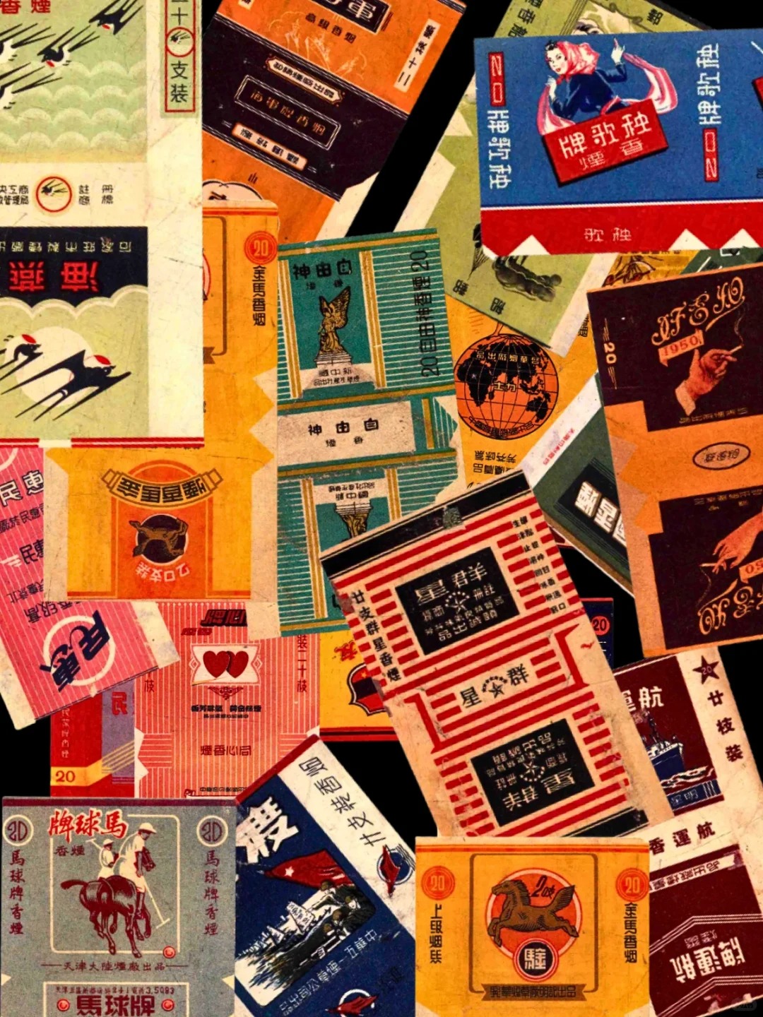
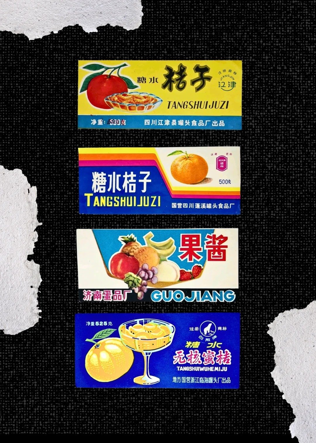
After opening up in 1978, shop shelves across China were alive with color. Candy wrappers, biscuit tins, and soap boxes carried playful mascots, bold Chinese art lettering, and intricate geometric borders. The wrapper printing industry and the technology it had at that time left its own unique mark—copperplate halftone textures, where shaded dots formed charmingly imperfect illustrations.
While nostalgic to look at, the visual richness of these designs came from deep roots. Paper packaging first appeared in the Tang Dynasty for tea and food. By the time of the Song Dynasty, copperplate-printed papers carried rabbits and floral motifs. In the Ming and Qing Dynasties, dragons signified power, whereas peonies were for wealth and honor.
Many people remember these packages as markers of prosperity. A blue-and-white Guangming ice brick paired with a sweating glass bottle of Coke is a must in summer. A bar of yellow sulfur soap from Shanghai was known throughout childhood stories as a cure for almost anything. Each package was a small piece of urban life, but also a reflection of a country moving into a new chapter.
By the early 2000s, the aesthetics of product packaging had changed. Minimalist, foreign-influenced packaging became fashionable, and ornate Chinese designs faded from the shelves. The rich borders, hand-drawn mascots, and halftone textures were replaced by sparse typography and muted palettes. What once felt fresh and proudly local was now seen as old-fashioned.
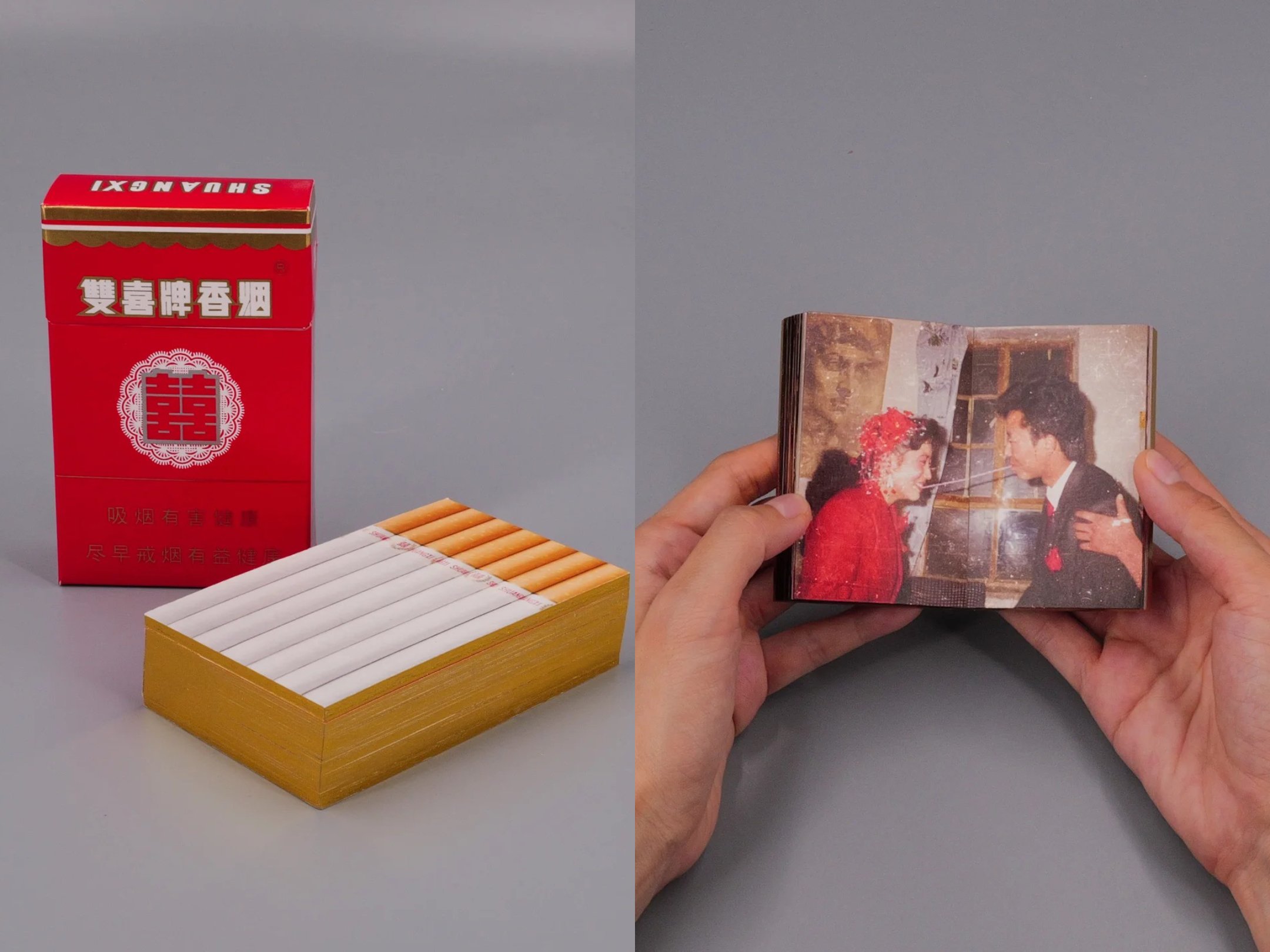
Today, these designs are finding their way back—not as pure replicas, but as inspiration. In 《Until Death Do Us Apart (双喜)》, an art book by Jia Za Zhi created from film negatives collected by Thomas Sauvin, the cover itself boasts the “Double Happiness” cigarette pack, still faintly scented with tobacco. Inside, wedding photographs from 1985–2005 evoke a time when offering cigarettes to guests was part of the celebration. It’s a book you that you don’t just look at; you hold it, smell it, and feel the years in its texture, much like the packages that inspired it.
Modern brands are also reinterpreting the past. Some bring back hand-drawn characters and Chinese lettering; others revive halftone patterns and ornate borders, blending them with contemporary layouts. For younger consumers, these designs feel novel. For those from the ’70s and ’80s generation, they are a direct line back to the shelves of their youth. For example, a designer transformed the logos of WeChat, Meituan, and Huawei into a retro, 1980s design style.
In revisiting these old packages, something more than nostalgia is at work. It’s a reminder that design can be deeply tied to memory, and that the objects we once took for granted—wrappers, labels, boxes—carry the pulse of an era. While even if the products have changed, the colors, patterns, and mascots of the past still speak, albeit subtly at times, it’s still vivid to anyone who can personally call them familiar.
Cover Image via Xiaohongshu.